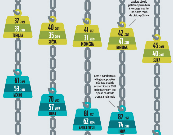
World infographics | Proteste Investe
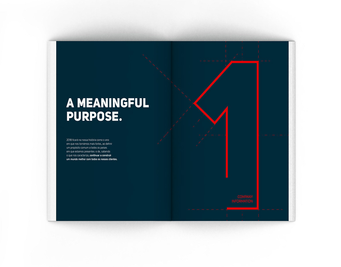
Report and accounts | Ascendum
Promotion Campaign | ASA
Pitch for promotion material for an editorial company
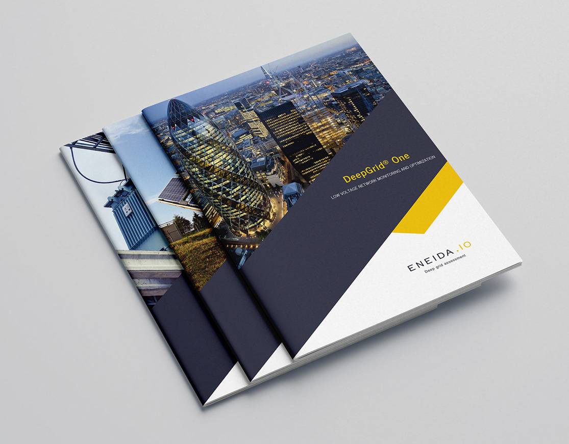
Visual Identity | Eneida
Visual Identity for energy device solution start-up
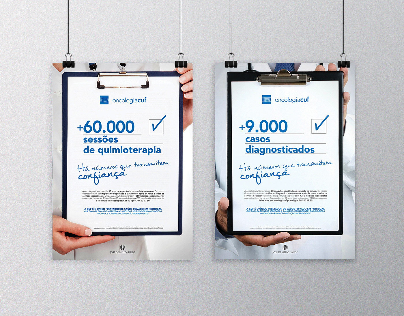
Ad campaign | CUF
Add campaign promoting Hospital Cuf oncology services.
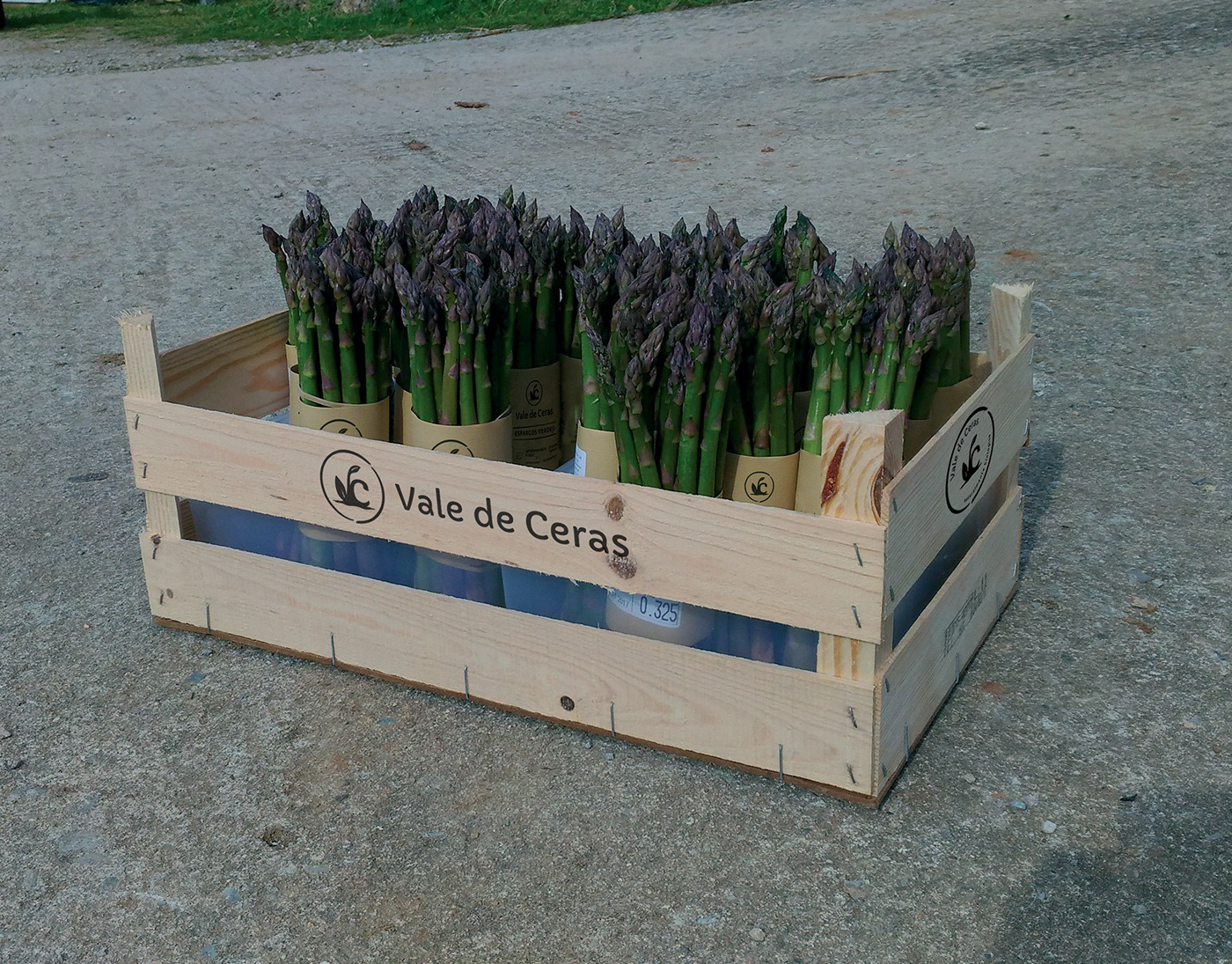
ID | Vale de Ceras
Branding and identity redesign for a biological agriculture company, now growing asparagus as the core business.
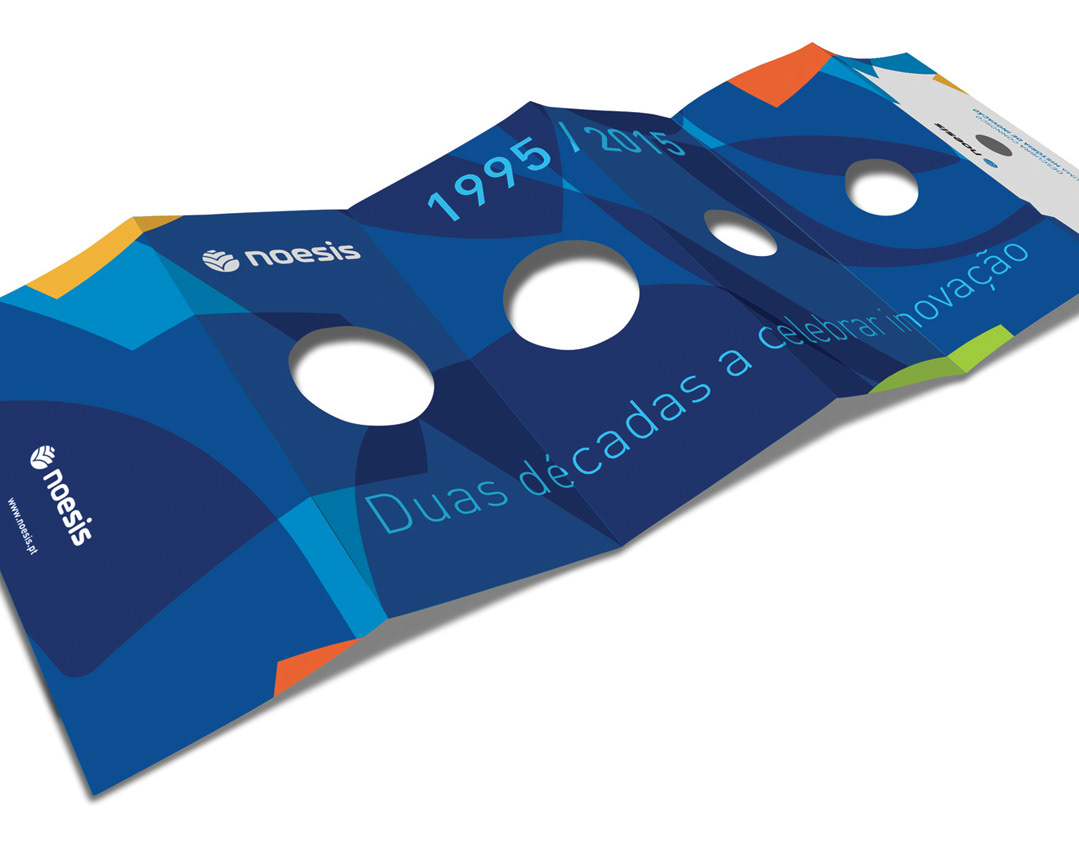
Visual Identity and Event | Noesis
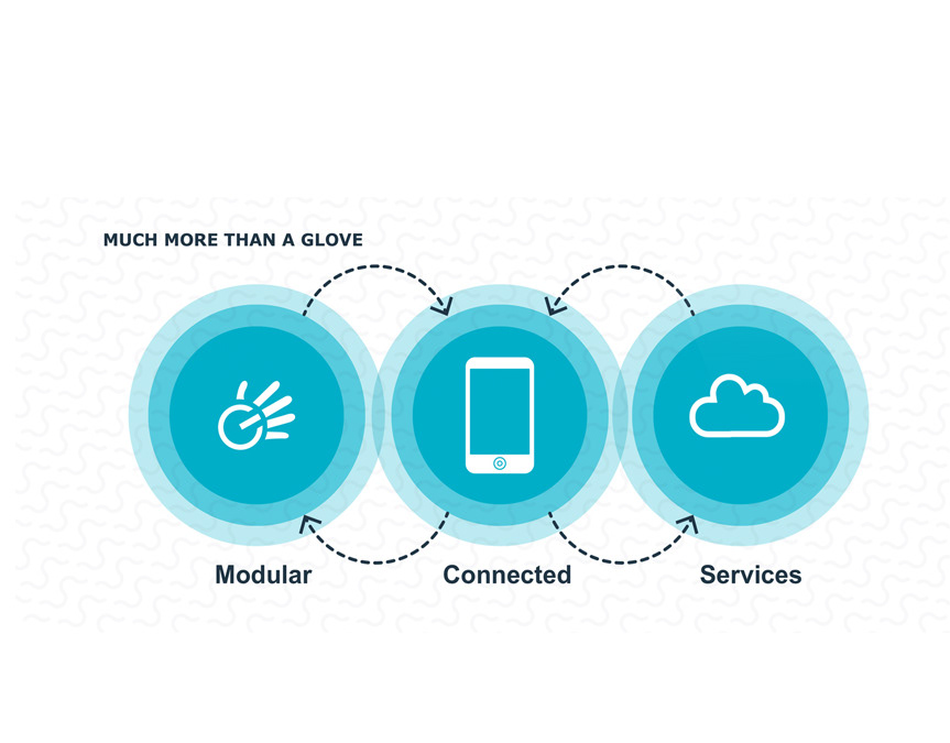
Digital Presentation | Nuada
Product release digital presentation
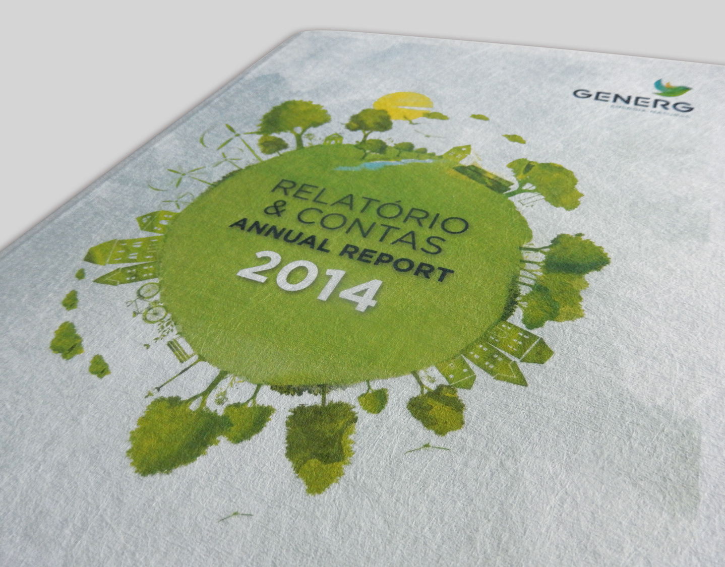
Annual Report | Generg
Generg is an energy company, focused on three clean sources: wind, sun and water. The graphic concept highlighted this sustainability, through a design inspired by hand painting, use of green and nature elements, and the use of recycled paper.
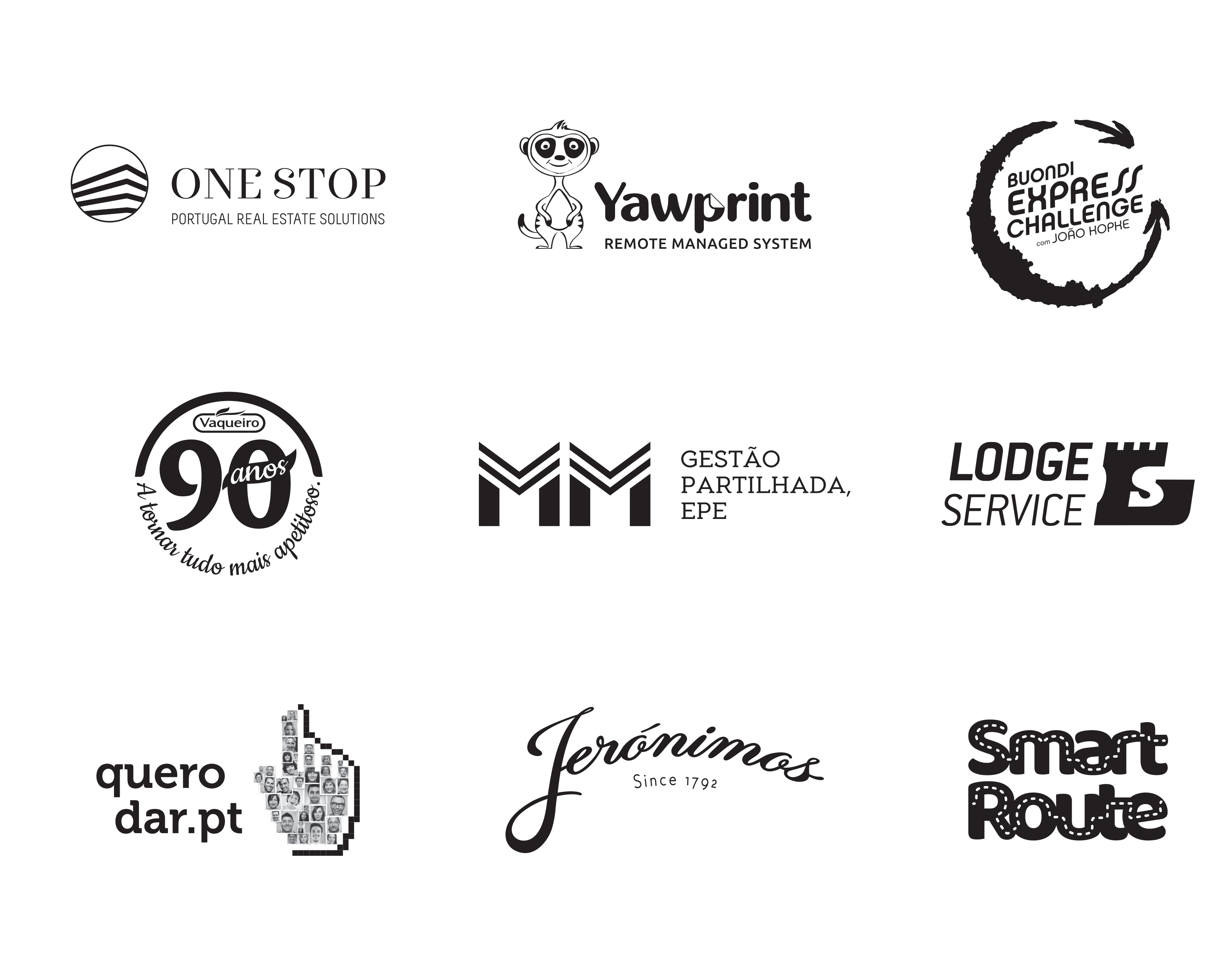
Logofolio | Branding #2
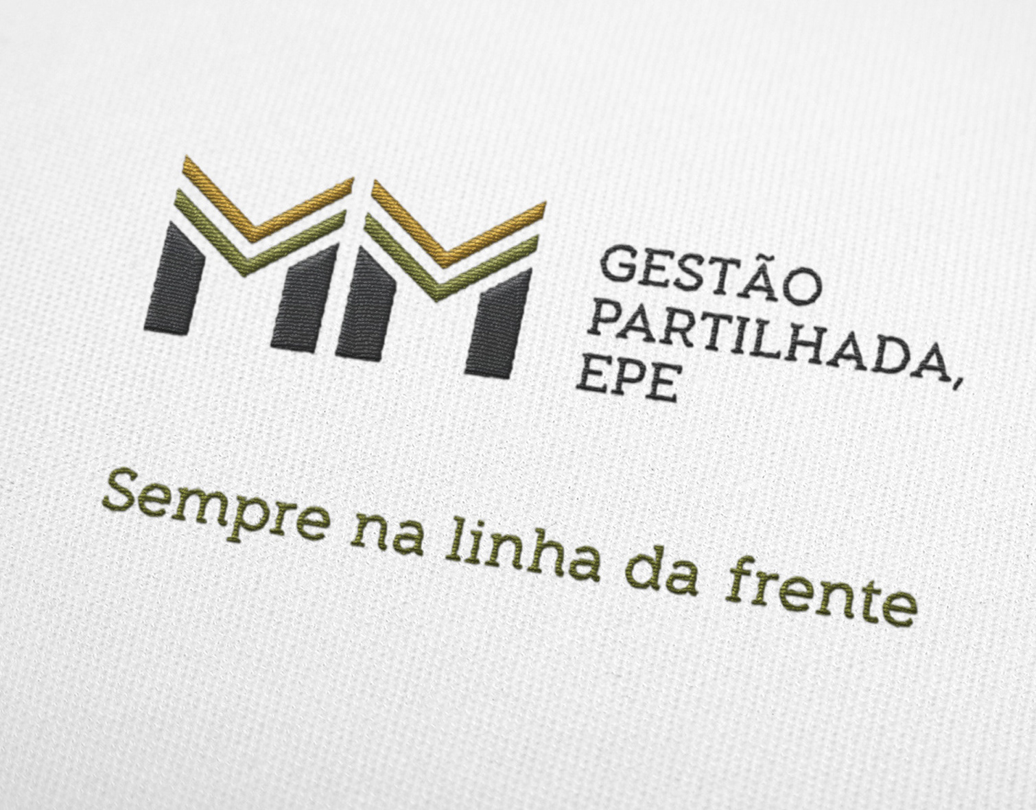
Branding | MM
Branding and Corporate identity for a food distribution company with a military background.
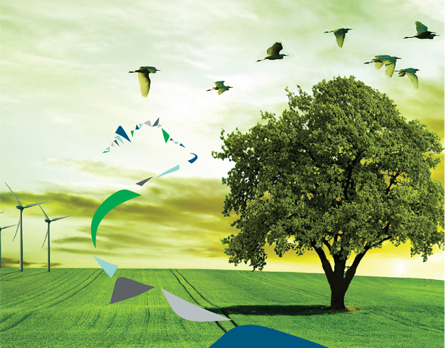
Annual Report | Iberwind
Iberwind is a player on wind energy in Portugal, it maintains and operates big wind farms through the country.
The concept of the report was to materialize the strength that empowers this company - the wind.
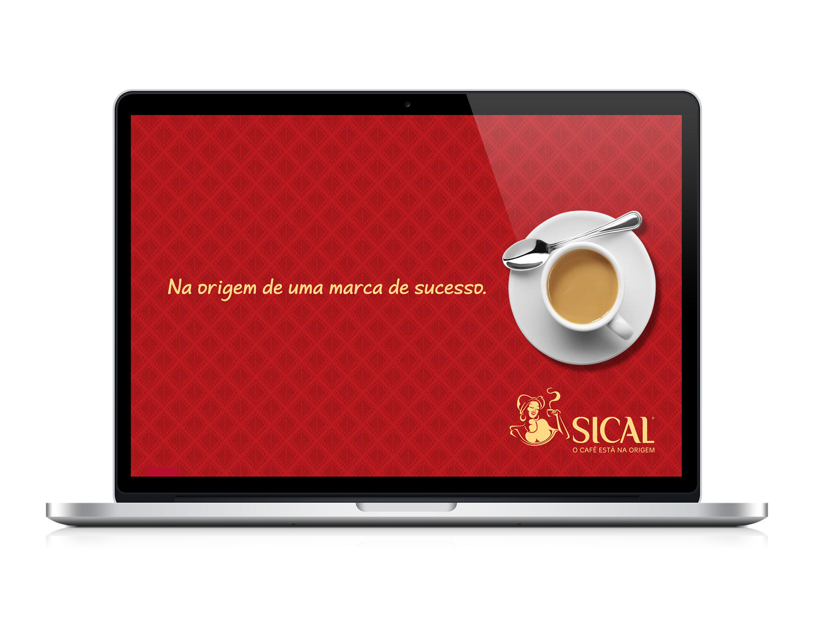
Sales presentation | Sical
Sical coffee brand sales presentation. The project goal is to give the salesmen an attractive tool with the brand's portfolio, with pictures and summary information.
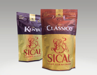
Coffee packaging redesign | Sical
Packaging redesign for Sical coffee brand. The main purpose was to highlight the remote origin of each pack while maintaining previous codes. The redesign was made carefully in order to keep its faithful target.
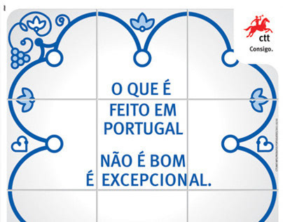
Awareness Campaign | CTT
CTT is the portuguese mail company. Appart the mail related business, CTT also sells, in its own stores, a wide range of products (books, games, souvenirs and many others). Many of these are made (and created) in Portugal and that mix of an offer was the reason for the briefing: to create a campaign to promote the portuguese products.
The graphics were based on a cultural asset of Portugal - the blue tiles - and the copy was made with rhyming headlines, also an important asset of the portuguese popular culture.
With the economical crisis, as well as the growing number of new made-in-portugal small businesses created, the poster image became viral in some social networks, creating awareness to all portuguese products in general.
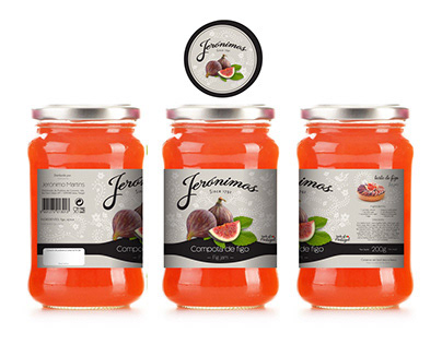
Rebranding and Packaging | Jeronimos
This pitch was about redesigning Jeronimo's packaging (a distribution brand), enhancing the portuguese eritage.
My idea was to gather portuguese cultural arts and crafts such as broadery, and turn it into a pattern. The brand was redesigned to embrace all the elements in the pack. It also included a traditional food recipe.
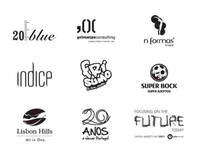
Logofolio | Branding
Small collection of logos and icons of companies or events.
(Some are only proposals - super blog awards, lisbon hills, microsoft 20 years or capital markets day for an oil company).
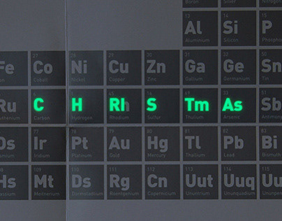
Christmas Card | Ciência Viva
Ciência Viva is a science and technology programme. It has a museum and several centers throughout Portugal. It promotes science in fun and engaging ways.
This year the christmas card had a scientific experience in itself. The table of chemical elements was reordered to hide a message. After a little light exposure, "merry christmas" glowed in the dark.
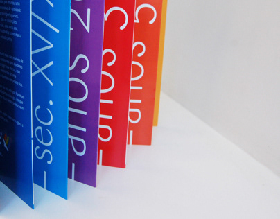
Booklet | 85 years Robbialac
In 2013, Robbialac celebrates its 85th anniversary with all customers and business partners. Its stores and website are the privileged media to communicate with all the brand's targets, but for the kick-off
Robbialac also presented a booklet that highlights the most relevant moments of the brand history.
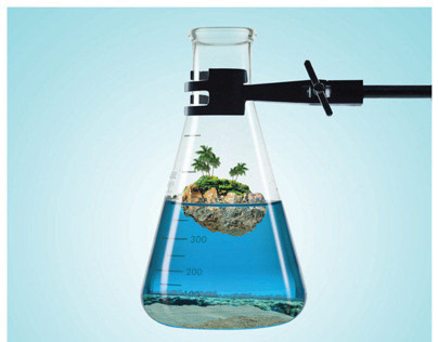
Posters | Ciência Viva
Ciência Viva is a science and technology programme. In the summer promotes science experiments throughtout the country, usually at vacation spots. To do so, a serious of vacation sets were created inside laboratory glassware, relating both concepts. (Only the first poster was printed).
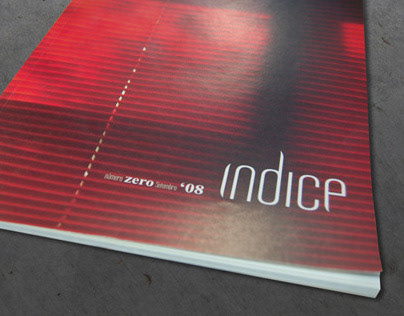
Editorial | Indice Magazine #0
Indice Magazine, issue 0, 64 pages, published by Mariposa Azual. Each Indice is intended to have a group of texts, promoting unknown writers.
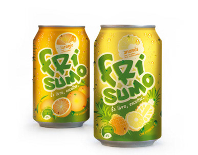
Rebranding and Packaging | Frisumo
All teenagers dream about freedom and independence. Frisumo's new brand wants to reach them by replacing the old, child inspired logo for an edgy, graffiti inspired one. Also, the brand was split in two parts, enhancing the"Fri" element, so it could relate to the word freedom.
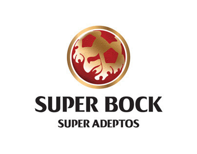
Branding | Super Bock Football
When in a game, football supporters are unique: the crowd is a vibrant, powerful and very emotional aggregate, living and sharing that moment. This inspired the logo design.
*Super Bock is a very popular portuguese bear. Super adeptos means huge football fans, and the aim of the brand strategy was to promote special experiences related to football world.
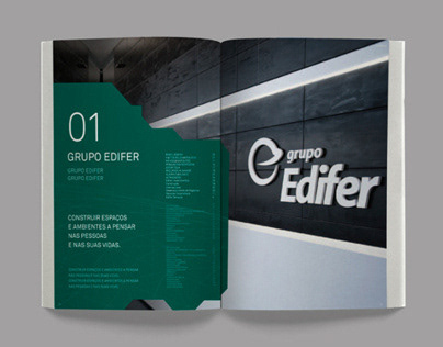
Annual Report | Edifer
Annual report design pitch for a constrution company, Edifer.
The company's claim, "beyond construction" opened the path for an ideia: to explore the three-dimensional representation of space in computer programs, which by definition have no boundaries.
The poligonal mesh was the basis of all layouts.
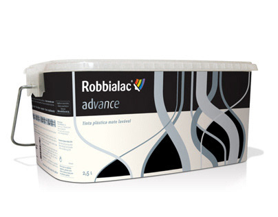
Packaging | Robbialac
Decorating means adding details to a space, creating depth and personality. This process inspired this paint package design. The silver lines interlaced themselves as if it were a braid.
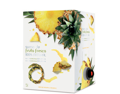
Packaging | Nutrigreen
A package with 100% fresh fruit juice, ready to drink at hotels and top restaurants. This was the starting point of the project.
The design intended to look like gourmet food.
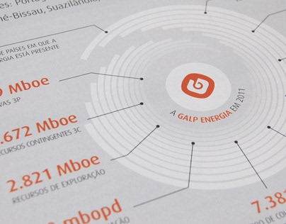
Annual Report | Galp Energia
Galp Energia is a portuguese oil company. To represent its growth in the past year, the concept was a propeller, meaning new projects would make the company move forward like an engine.
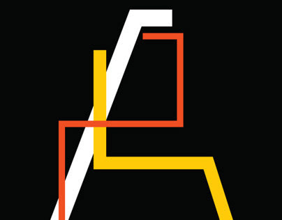
Reticular Font
“Reticular” is inspired by grid maps.